Friday, April 1, 2011
Monday, March 28, 2011
Logo Set 3
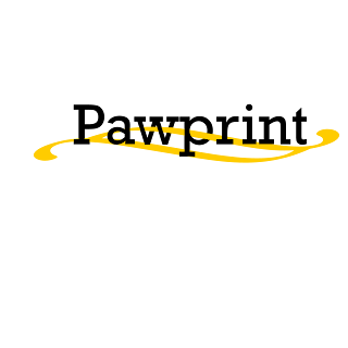
LOGO SET 3:
For this set of logos, I used our school’s newspaper title “The Pawprint” and tried to create a simple yet sophisticated logo. For this project, I used the Custom Shape Tool to draw the both the blue and gold lines. These colors, “the blue and the gold”, also express our school colors. For each line that was drawn, a new layer was made. As you can see in LOGO C, the second line overlaps the ‘P’ in ‘Pawprint’
As for LOGO C, the Custom Shape Tool was also used. The ornament is meant to look as if it were intertwined with “Pawprint”. No blue was used for this set because gold and black are well functioned contrast colors.
Logo Set 2
LOGO SET 2:
For this logo, instead of making the usual 'Got Milk' quote, I drew a milk carton, for which I used both the pen and path tools to design. I also used the Custom Shape tool to draw the circles, which are the eyes.
For this logo, instead of making the usual 'Got Milk' quote, I drew a milk carton, for which I used both the pen and path tools to design. I also used the Custom Shape tool to draw the circles, which are the eyes.
Friday, February 25, 2011
Wednesday, February 9, 2011
Friday, November 19, 2010
Friday, September 24, 2010
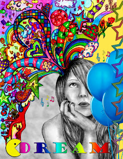
Montage Project

Reflection:
During the process of this project, I was rather confused as to what had to be done, considering that I was absent when the montage was assigned. I made several other montages but wasn’t satisfied with the results. As I was doing the assignment, it was difficult because I didn’t know what tools we were able to use. All in all, this was a hard assignment for me. I know I could’ve done better. No more absences for me!
During the process of this project, I was rather confused as to what had to be done, considering that I was absent when the montage was assigned. I made several other montages but wasn’t satisfied with the results. As I was doing the assignment, it was difficult because I didn’t know what tools we were able to use. All in all, this was a hard assignment for me. I know I could’ve done better. No more absences for me!
For the project, I used various techniques like the layer mask, move tool, brushes, text, and how to manipulate color.
Subscribe to:
Posts (Atom)


